MassInfra — 2020
Helping MassInfra become a people-oriented marketing automation agency.

After updating their logo, marketing & sales automation agency MassInfra was looking to upgrade their whole brand experience and website to match their people-oriented approach: helping clients save time and
still increase their customer base!
PROJECT DURATION
2 months
TEAM
1 Copywriter
1 Frontend Developer
1 Projectmanager
1 UX / UI Designer
MY ROLE
In this project I was responsible for expanding the brand experience based on the company’s core values, renewing the information architecture, visual concepting & the visual design.
Problem
The corporate look of the outdated visual identity no longer matched the human core & values of MassInfra.
As part of the online advertising agency MassMovement, MassInfra focuses mainly on the marketing & sales automation possibilities for its customers. As one of the few Active Campaign Certified Consultants within the BeNeLux, Massinfra can help its customers set up and optimize their Active Campaign account, all with full Dutch support.
The strength of MassInfra lies therefore not so much in the use of a full-fledged marketing automation package, but more in the knowledge and human treatment that goes with it. You can automate your marketing and sales fantastically, but in the process around it, it’s very reassuring to deal with real people. That is the power of MassInfra. Real specialists who help you with everything related to marketing automation & Active Campaign.
Starting with a solid foundation for a human identity.
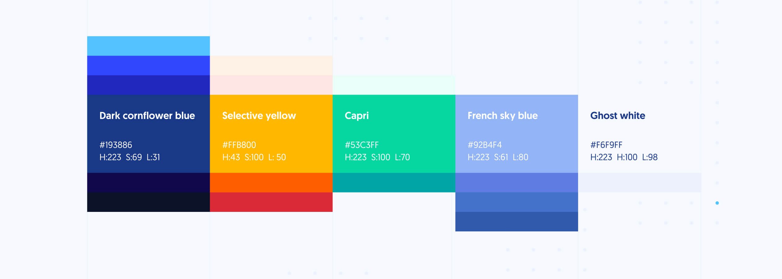
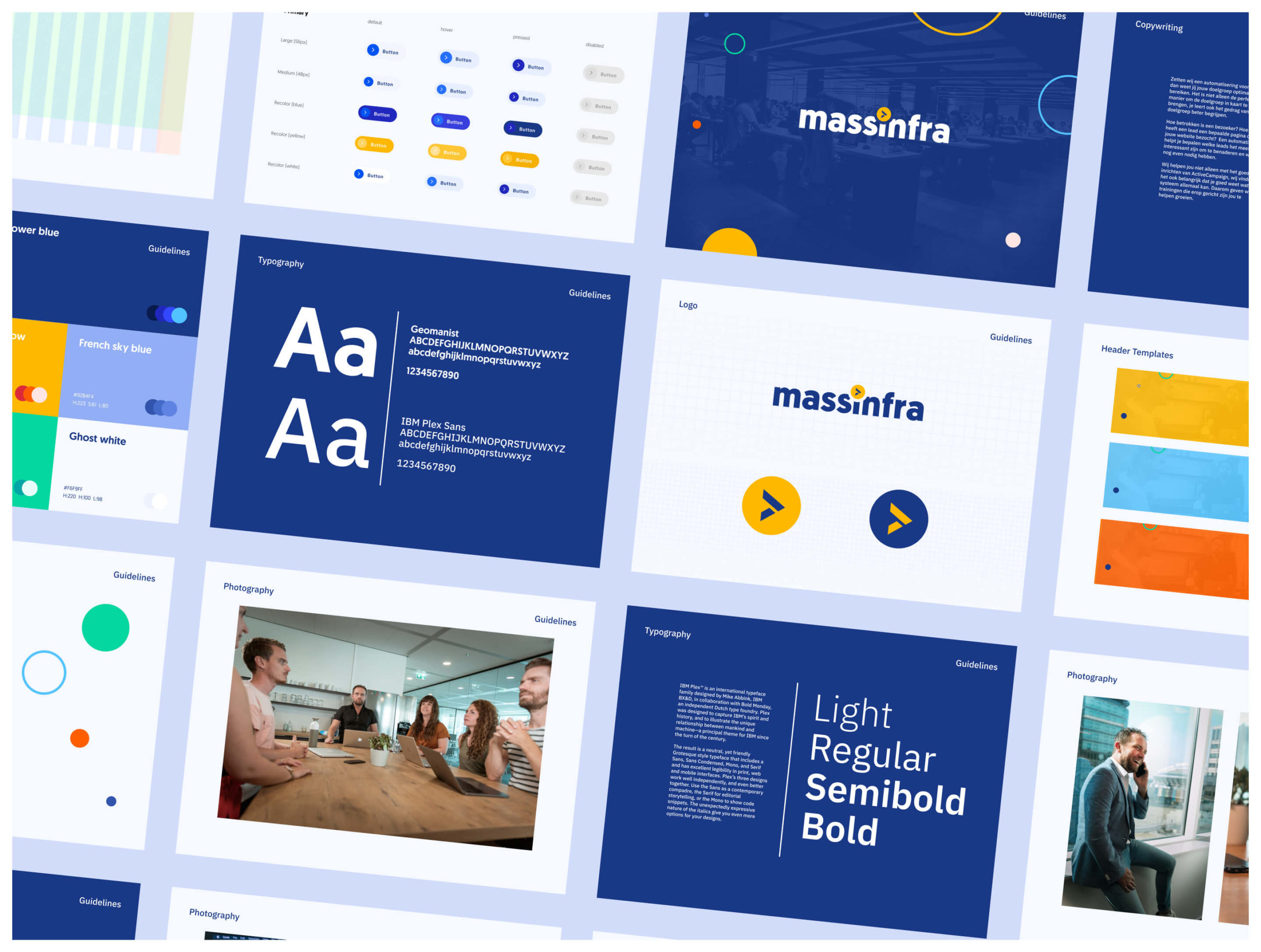
The start of the new identity began with a selection of color. As part of MassMovement, we wanted to get closer to the parent agency in terms of color use. The previous style only used blue and white, which in our opinion gave too few possibilities to represent the diversity of specialists within MassInfra.
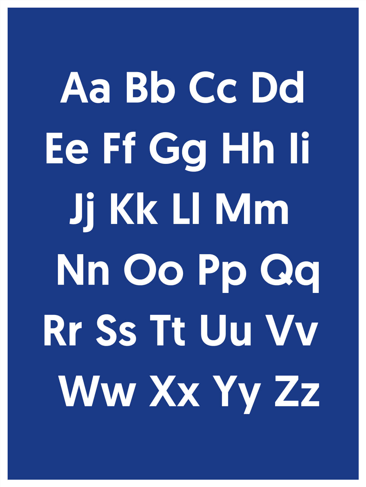
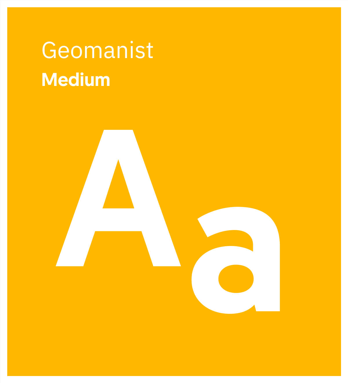
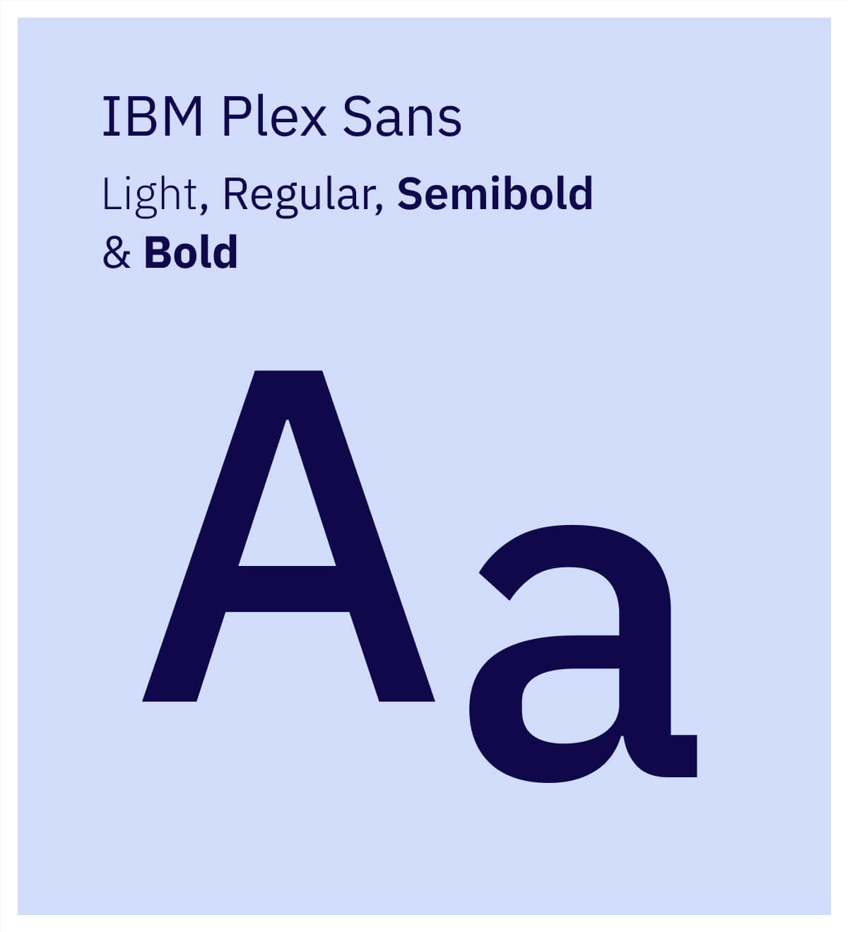
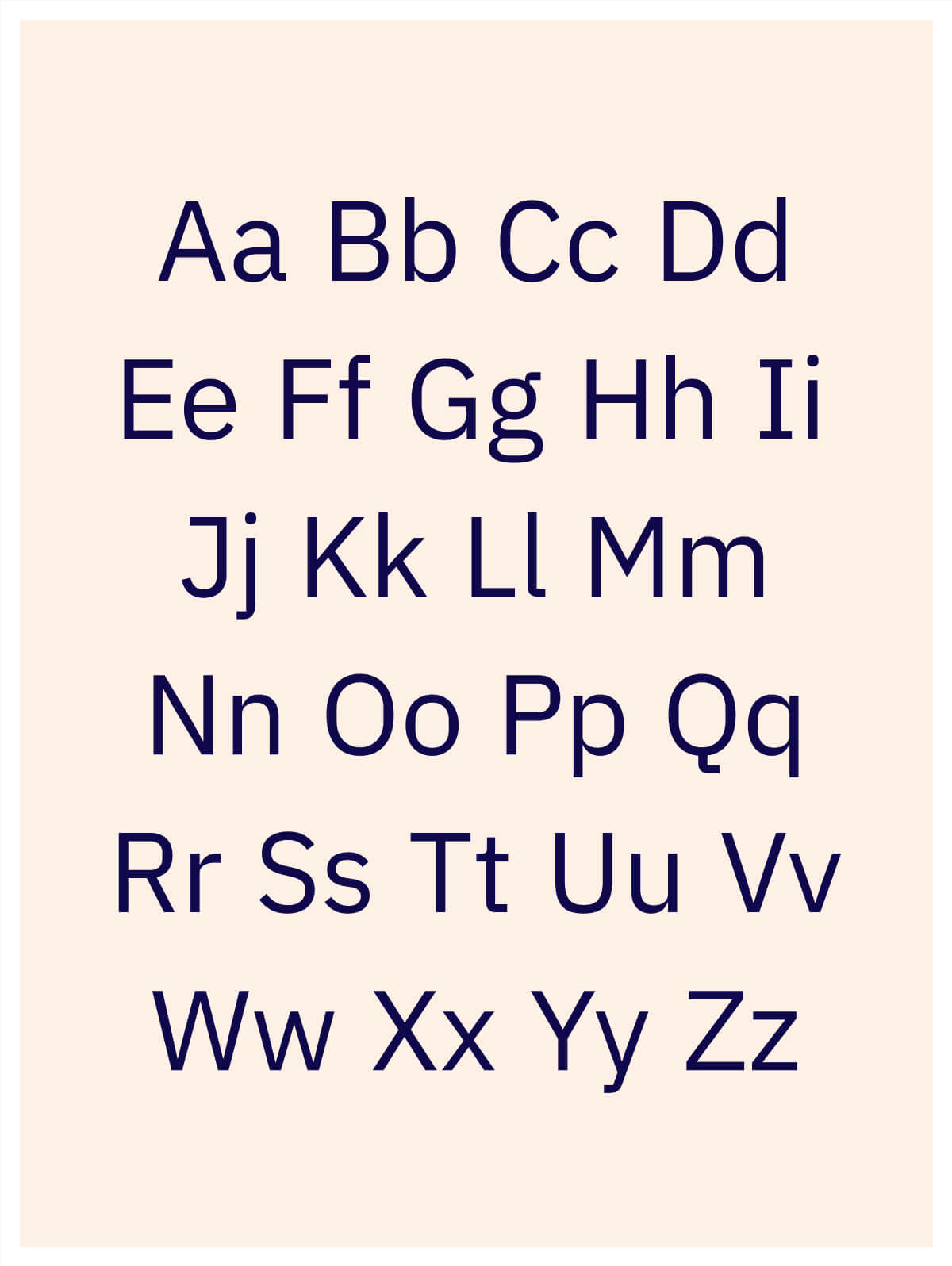
Within the new styling, blue is still present as a strong basis, but we have expanded the palette around it with brighter, more striking colors. As a display typeface we use Geomanist, this font combines geometric shapes with a more humanistic character. For web texts and paragraphs we use IBM Plex Sans, a font designed to capture the unique relationship between man and machine.
A visual language, connecting the dots
MassInfra's business approach is largely based on the wishes of their customer. The marketing automation system can be set up by means of various APIs and links, in such a way that a customer does not have to change their ecosystem to get started with powerful automations. After an inventory of used systems, MassInfra can advise on the approach and realize the right connections. Even when systems change or new systems are used, they can easily be connected to existing automations. As a user you are therefore not bound by a vendor lock or other system obligations.
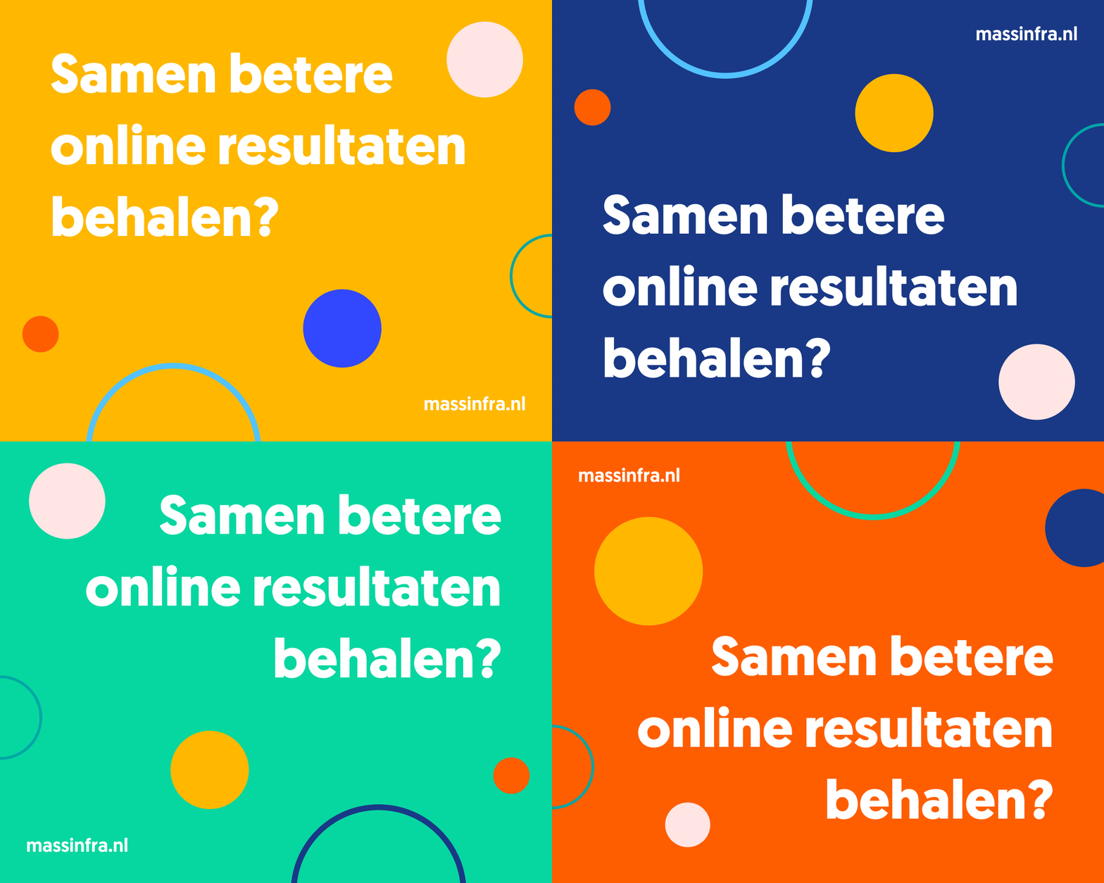
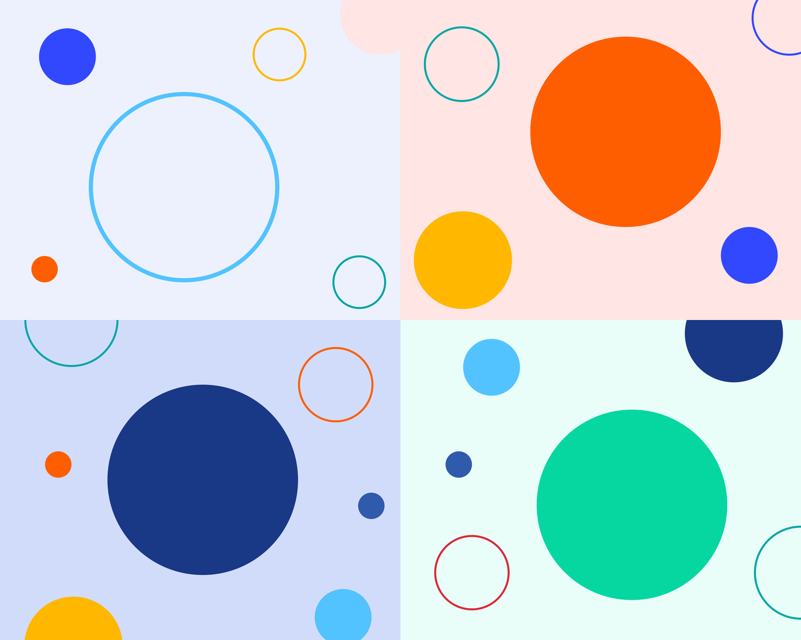
This is the biggest pillar we have included in visual identity. We symbolize the ease with which systems can be connected together with all sorts of colored circles. A full color circle represents an active connection and the outlined circles are inactive connections, which can be activated at a later stage.
Bringing it all together
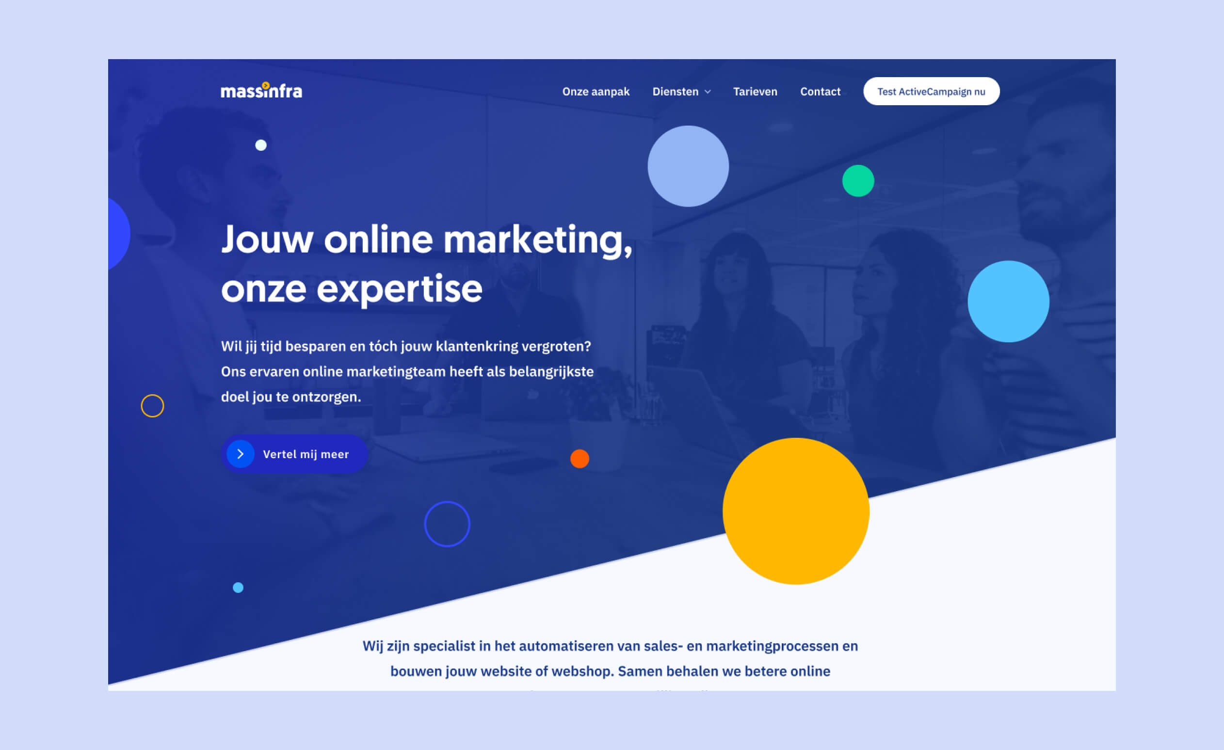
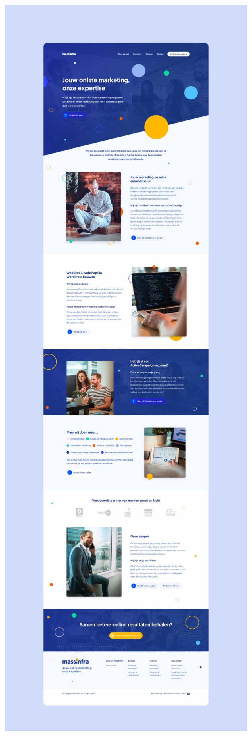
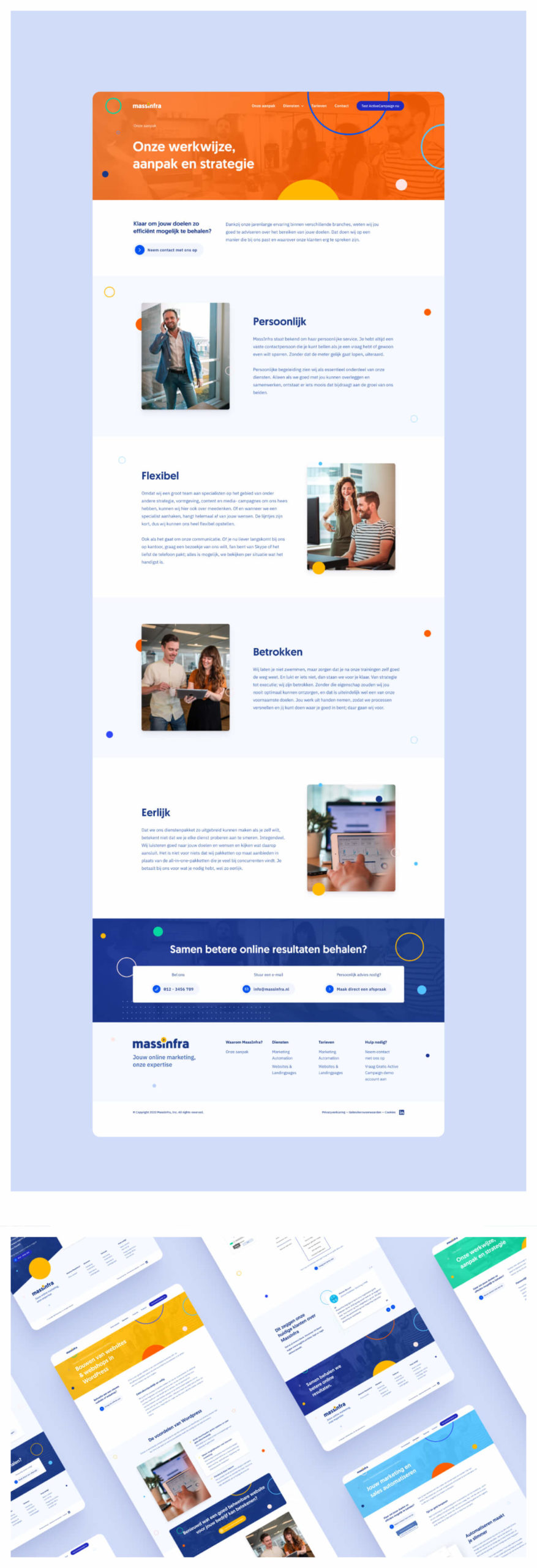
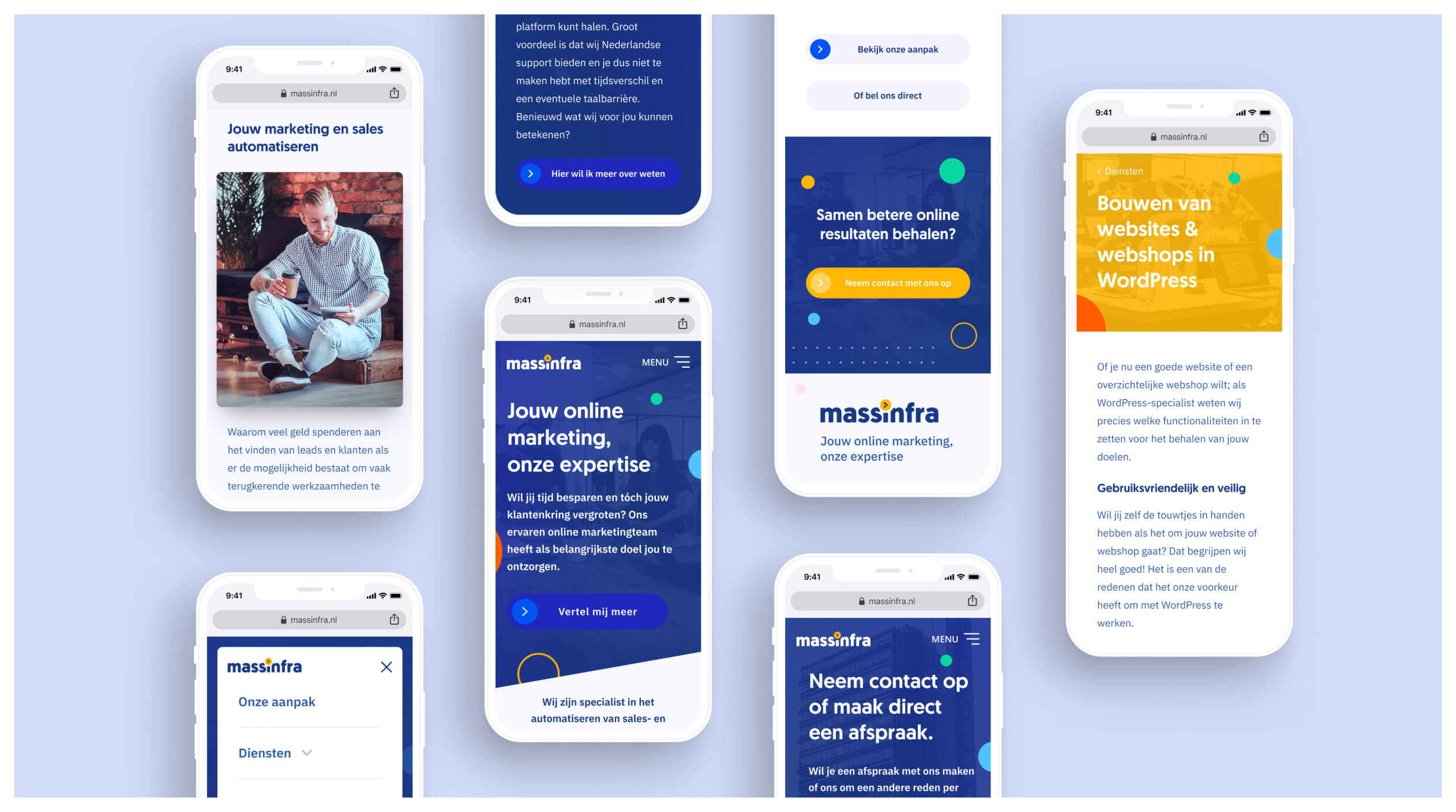
For the website it was important that users get the feeling that they are dealing with a team of genuine specialists. In the visual appearance, this means a lot of use of photography with real people, if possible, no complicated screenshots or illustrations of the system, but the people you will be dealing with.
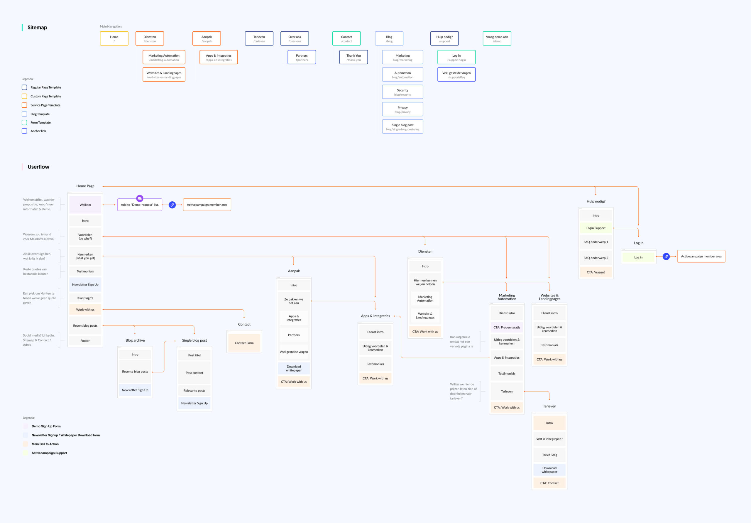
For the information architecture, the focus was mainly on informing new business opportunities. The homepage is a collection of the different facets of MassInfra. We tell a little bit about the agency and explain the approach. Interested parties can request a demo account directly from this page, others can click through to the in-depth pages of a service.
Featured case studies
